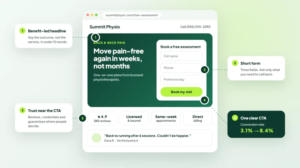
A landing page has one job: persuade a visitor to take a single, specific action. Whether that visitor arrives from an ad, an email or a search result, the page either earns the next step or loses it.
The good news is that most conversion problems come from a short list of fixable issues. This guide from digital marketing agency Twastia.io covers the landing page best practices that matter most for small businesses.
What Makes a Landing Page Different
A typical website page supports exploration, with menus and links to many places. A landing page is built around one goal, such as booking a call, requesting a quote or downloading a guide.
That focus is what makes it effective. Every element should either build confidence or move the visitor toward that single action.
1. Match the Message to the Source
Visitors arrive with an expectation set by the ad, email or link they clicked. If the page does not confirm it within seconds, many will leave.
Repeat the core promise and keywords from the source in your headline. For paid traffic, that usually means one landing page per theme, so ad groups and pages should be planned together. Our guide to structuring a Google Ads account shows how.
2. Write a Clear, Specific Headline
The headline should state what you offer and why it matters, in plain words. Clever wordplay often costs clarity.
- Lead with the outcome the visitor wants.
- Use a subheadline to add a key detail, such as who it is for.
- Keep both short enough to read at a glance on a phone.
3. Keep One Primary Call to Action
Competing offers split attention. Choose one primary action and repeat it at natural points down the page.
Make the button text specific, such as “Get my free quote” rather than “Submit.” Use a color that stands out from the rest of the design, with space around it.
Consider Removing the Main Navigation
Many landing pages hide the full site menu to reduce distractions. Keep your logo and essential links, such as your privacy policy, and test whether the simpler layout helps.
4. Make Forms Short and Easy
Every extra field asks for more effort. Ask only for what you need to follow up, and save other questions for later.
- Use clear labels above each field, not just placeholder text.
- Show helpful error messages that explain how to fix a problem.
- Make fields large enough to tap easily on mobile.
- Tell people what happens after they submit.
Accessible forms are easier for everyone to complete. The W3C forms accessibility tutorial is a practical reference.
5. Show Genuine Proof
People want reassurance before they act. Use proof you can stand behind, such as real customer reviews, clear guarantees, relevant qualifications or examples of your work.
Never invent testimonials, ratings or results. Fake proof damages trust quickly and can break advertising and consumer protection rules.
6. Design for Mobile First
Many visitors will see your page on a phone. Design for small screens first: a readable font size, a visible call to action and a layout that does not require zooming.
Test the page on real devices, not just a resized browser window. Tap every button, fill in the form and check that pop-ups or chat widgets do not cover the content.
7. Make It Fast
Slow pages lose visitors before they see your offer. Compress images, limit scripts and use reliable hosting. The Web Vitals guide on web.dev explains the loading, responsiveness and stability metrics worth tracking.
8. Structure the Page Logically
A simple order works for most offers:
- Headline, subheadline and primary call to action.
- The problem the visitor has and the result you deliver.
- How it works, in three or four steps.
- Proof and reassurance.
- Answers to common objections, often as a short FAQ.
- A final call to action.
9. Test and Improve
Treat every landing page as a work in progress. Track conversions, review how visitors behave and test one change at a time, such as a new headline or a shorter form.
Let each test run long enough to collect meaningful data. Small samples can produce misleading winners.
Key Takeaways
- Build each landing page around one goal and one primary call to action.
- Match the headline to the ad or link that brought the visitor.
- Keep forms short, clear and accessible.
- Use only genuine proof, and design for mobile and speed.
- Test changes one at a time and keep improving.
Planning a bigger update? Our website redesign checklist explains how to protect your rankings while you improve conversions, and our web design articles cover more ways to build pages that perform.
Turn More Visitors Into Leads
A focused landing page can make every marketing channel more effective. If you would like pages designed and built for conversion, explore the Twastia.io web design and development services.
Want to know why your current pages are not converting? Request a free growth audit, and Twastia.io will review your landing pages and highlight the changes most likely to improve results.